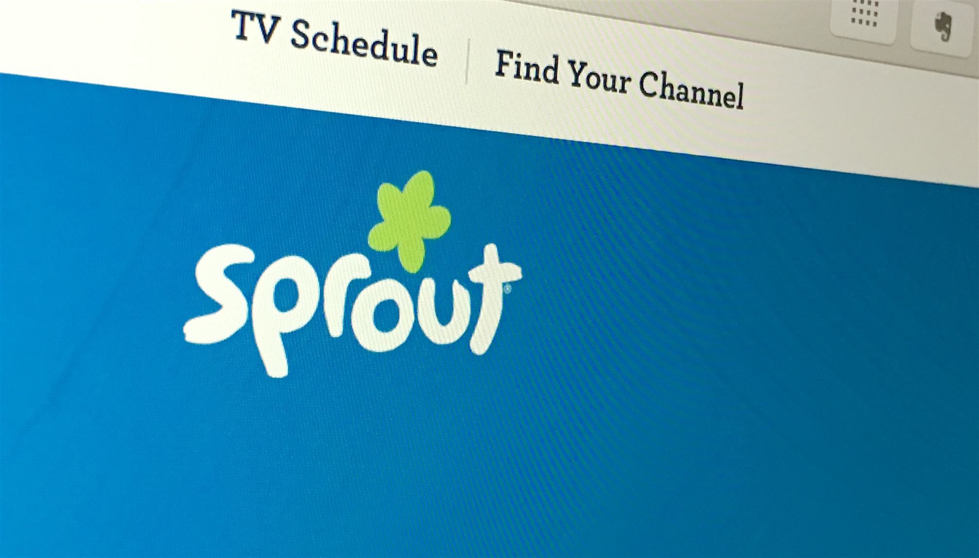
Somehow all of the patterns, illustrations and images are held together nicely in this design. The custom typography is a nice touch. That combined with careful use of color and animation make sproutonline.com usable and entertaining. Even the boring parts of the site look good which is important to recognize because large network’s web presence can easily become visually frankenstein’d as you move from page to page.
Take notes Disney and Nickelodeon.
<iframe src="https://player.vimeo.com/video/173698016?autoplay=1&loop=1&color=333333&title=0&byline=0&portrait=0" width="640" height="400" frameborder="0" webkitallowfullscreen mozallowfullscreen allowfullscreen></iframe>
sproutonline.com


