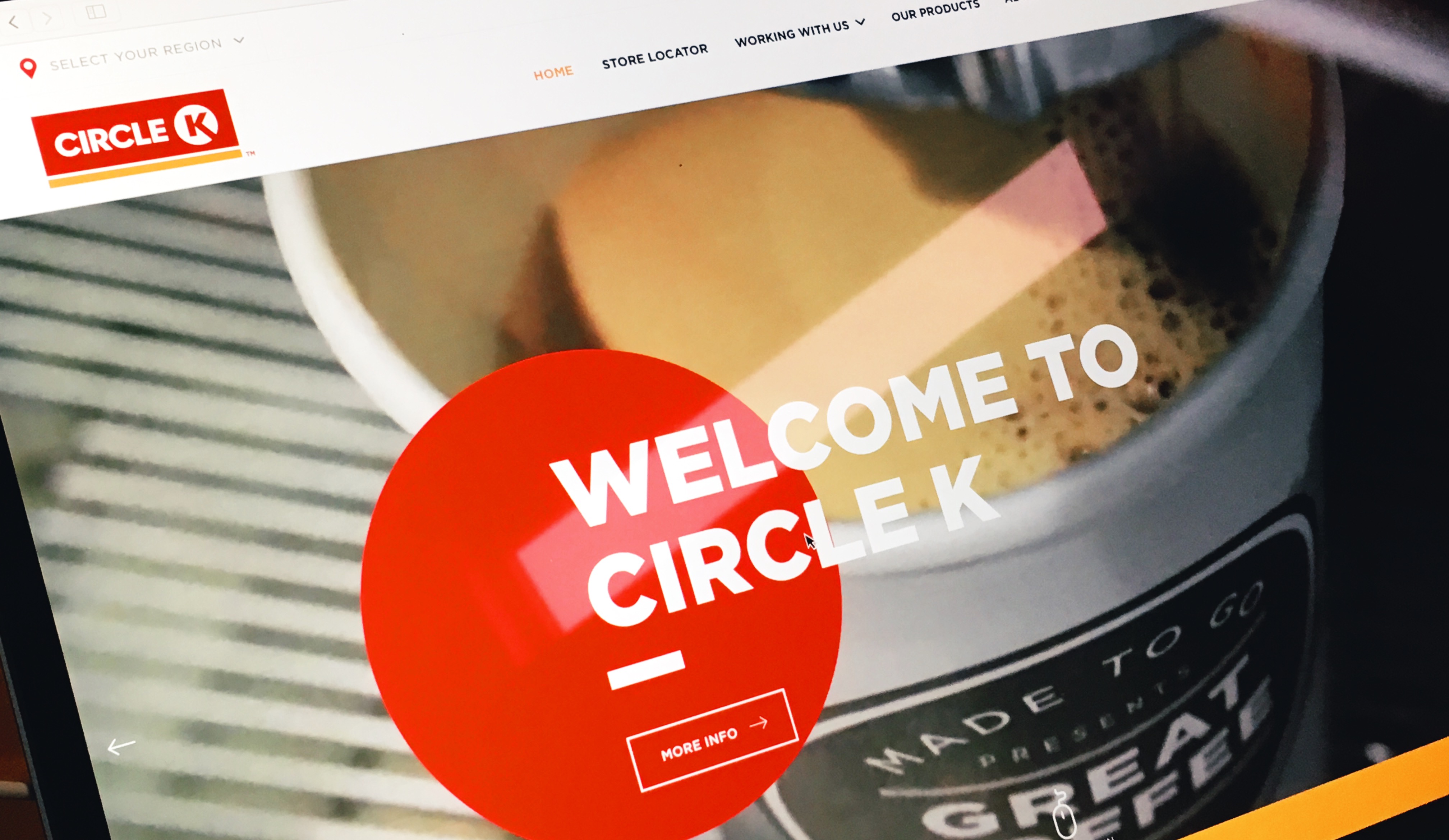
After investigating this category of web sites for a project I’m working on, Circle K really stood out. The copy reads well, the typography is thoughtful and the micro interactions all come together nicely.
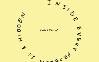
Quote Note 15 – Marty Neumeier
Inside every problem is a hidden solution.


