by Joshua Myers | Mar 9, 2017 | Blog Posts
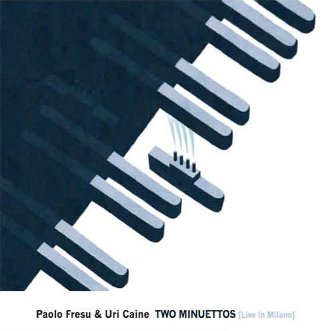
It’s official. Although it’s still early in the year I’m confident it won’t be beat. itunes

by Joshua Myers | Jan 18, 2017 | Blog Posts
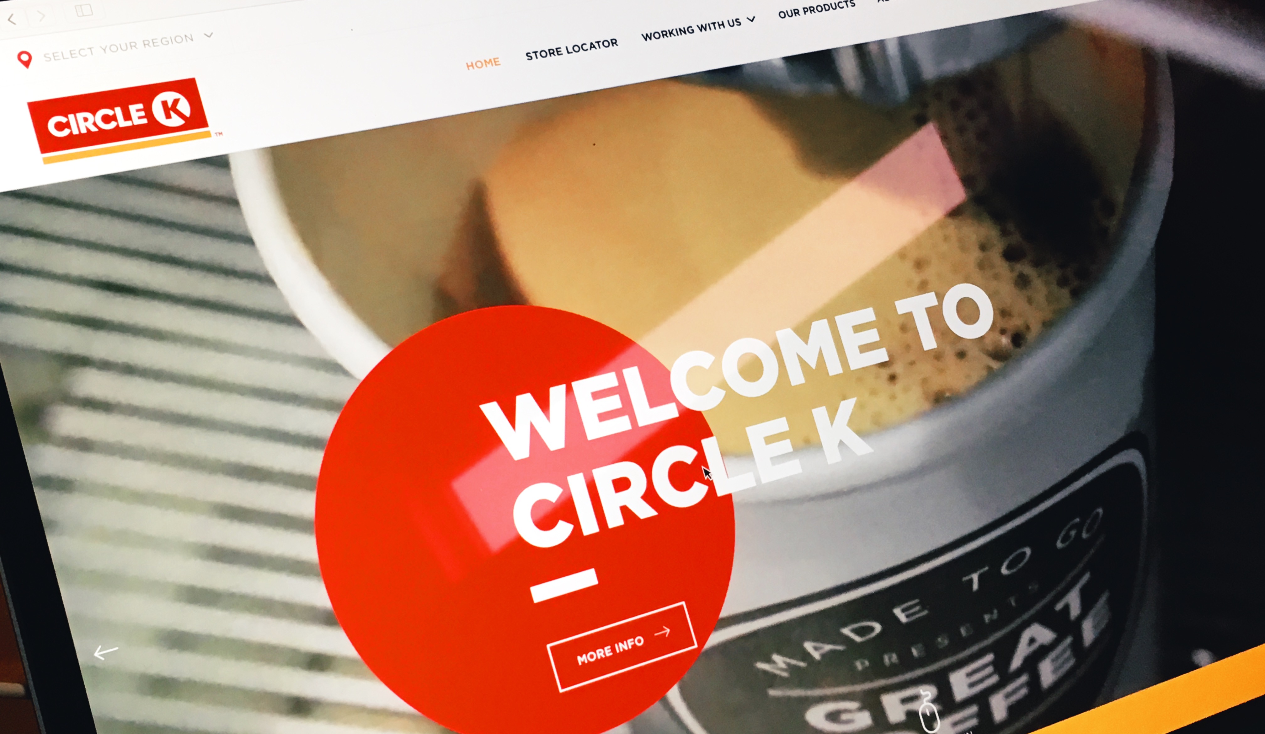
After investigating this category of web sites for a project I’m working on, Circle K really stood out. The copy reads well, the typography is thoughtful and the micro interactions all come together nicely. As a bonus, they have this great movie about their...
by Joshua Myers | Dec 23, 2016 | Blog Posts
Matt Mullenweg, on the release of a new homepage for WordPress.org, which hasn’t seen a redesign in a long time: What’s on the page today actually isn’t that important, even though it’s better in many ways, the key is that it’s changing again, the stone has been...

by Joshua Myers | Dec 21, 2016 | Blog Posts
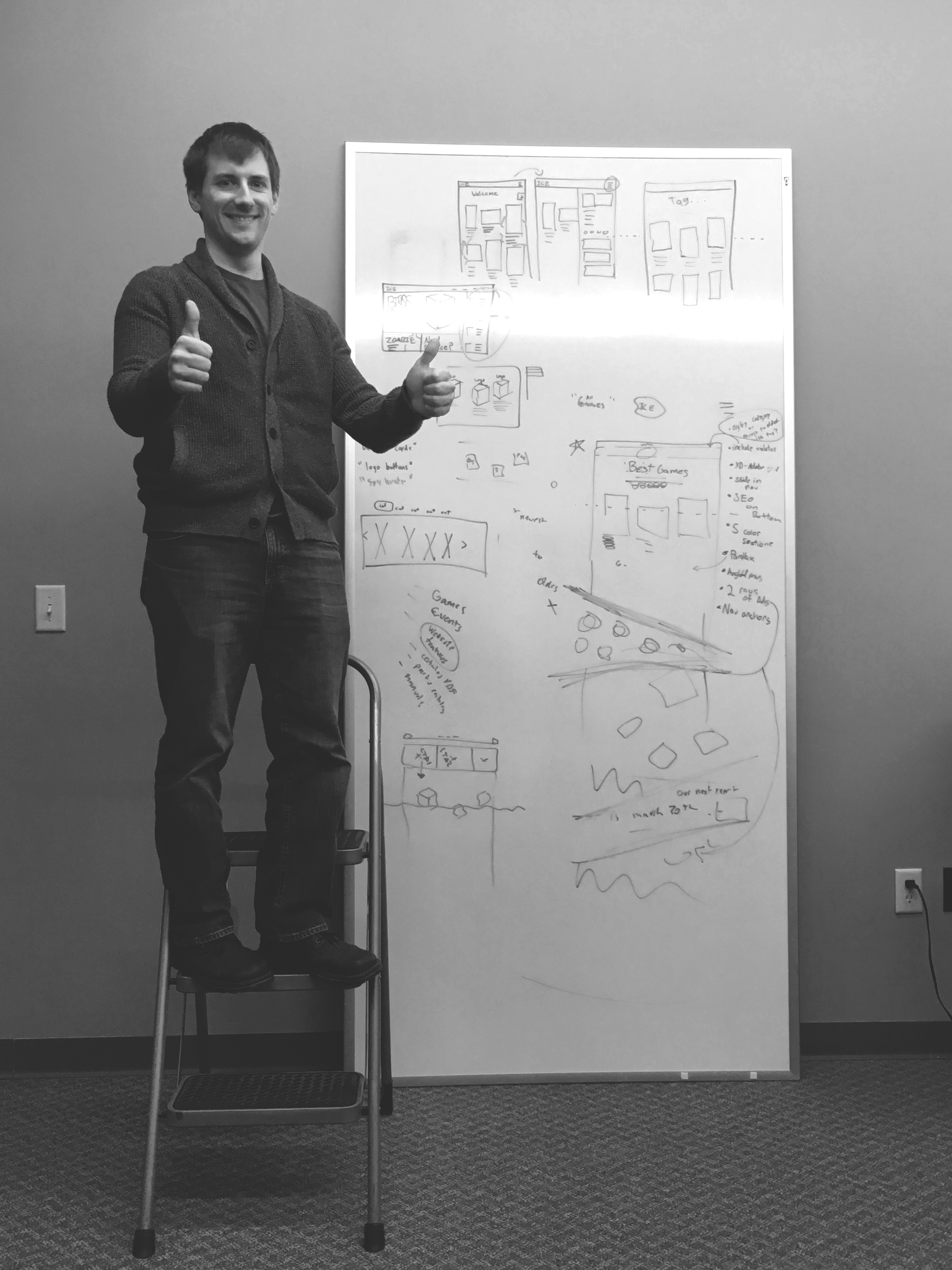
My colleague Jon posing for the camera on a latter in celebration of a web layout breakthrough for ICE.
by Joshua Myers | Oct 21, 2016 | Blog Posts, Quotes
Source

by Joshua Myers | Sep 26, 2016 | Blog Posts, Typography
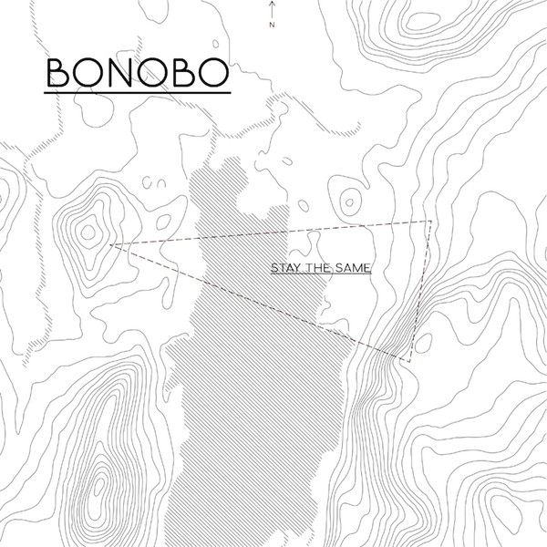
I’ve been using the saying “less is more work” lately around my colleagues. For me Bonobo’s album art aesthetic captures the meaning of that statement. I like how the circular theme is weaved...
