Josh Myers
  • Home
  • Presentation Design
  • Production Design
  • LinkedIn
  • Get in Touch
Select Page
The beautiful album art of Bonobo

The beautiful album art of Bonobo

by Joshua Myers | Sep 26, 2016 | Blog Posts, Typography

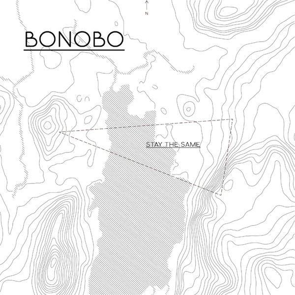
I’ve been using the saying “less is more work” lately around my colleagues. For me Bonobo’s album art aesthetic captures the meaning of that statement. I like how the circular theme is weaved...

A percussive recap of today’s Apple event, 107 seconds.

by Joshua Myers | Sep 7, 2016 | Blog Posts, Typography

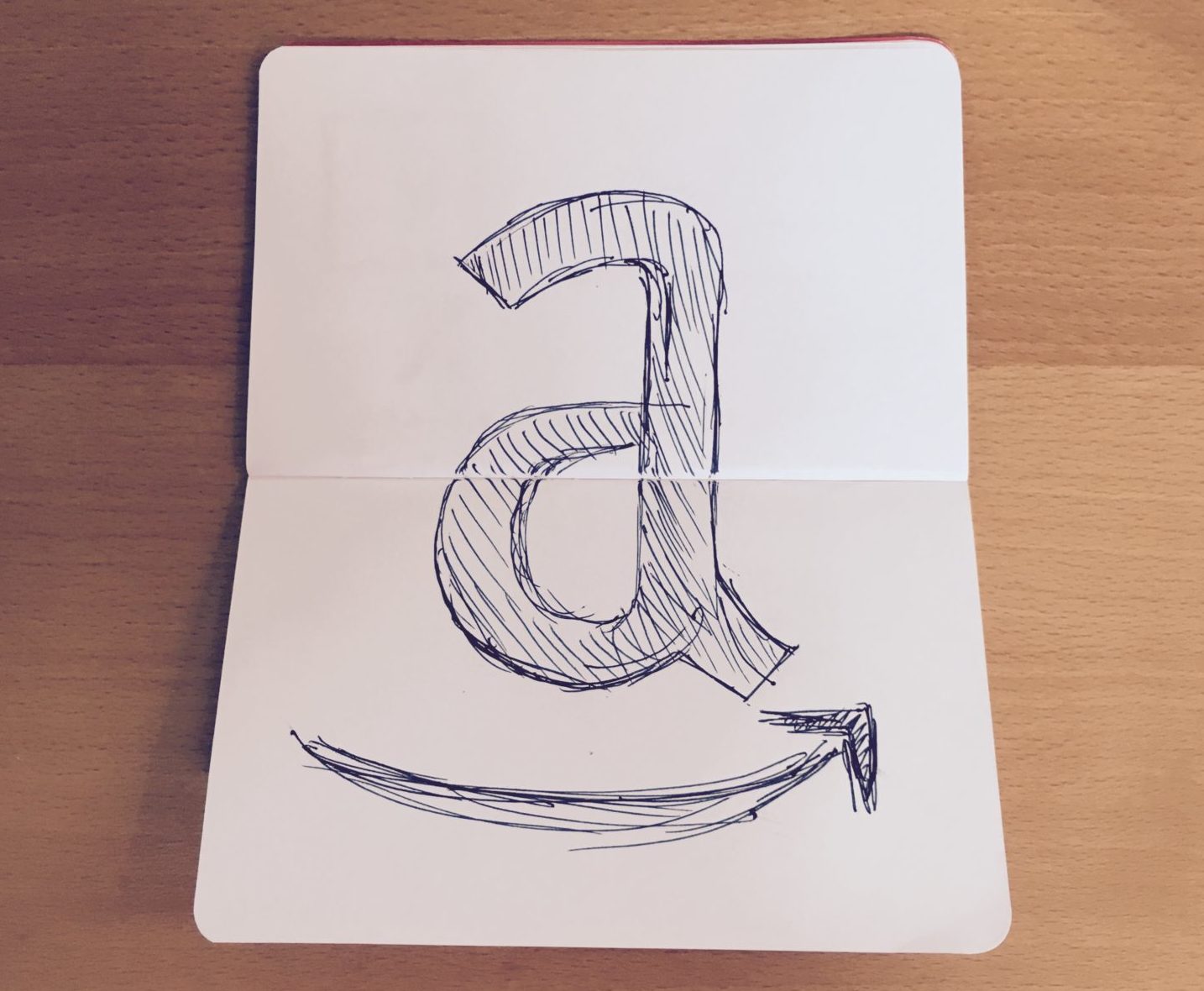
Now this is more like it!
Sharpie hand lettering 

Sharpie hand lettering 

by Joshua Myers | May 28, 2016 | Blog Posts, Typography

A to Z

A to Z

by Joshua Myers | May 5, 2016 | Blog Posts, Typography

Didot doodle

Didot doodle

by Joshua Myers | Apr 1, 2016 | Blog Posts, Typography

This typographic print ad about the web on the back of the latest issue of Comm-Arts is great.

by Joshua Myers | Mar 1, 2016 | Blog Posts, Typography

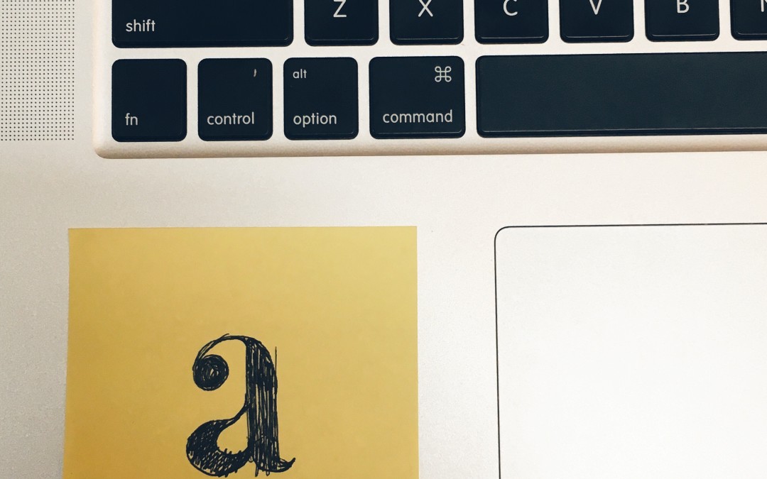
You know it’s good when you wish you thought of it.  
« Older Entries
Next Entries »

Recent Posts

  • Quote Note 15 – Marty Neumeier September 18, 2023
  • Quote Note 14 – David Carson September 7, 2023
  • Fun logo design project #cheerdad July 26, 2023
  • Drawing boxes for a living August 26, 2022
  • Video shoot for the RunSmart Online app August 26, 2022

SEE ALL BLOG POSTS

© Joshua Myers